Power Shift Network
Branding • Web Design • Print Design
Power Shift Network has become a force for good in communities across the United States through grassroots campaigns and advocacy efforts.
By working in partnership with like-minded organizations and individuals, the organization is able to amplify impact and drive progress towards a more just and equitable society. Power Shift Network’s approach to youth activism has earned recognition and celebration from leaders in the fields of social justice, environmental activism, and more.
With a talented team of professionals and a network of dedicated volunteers, the organization continues to drive progress on the most pressing climate issues of our time.
With a commitment to collaboration and a passion for empowering youth, Power Shift Network is creating lasting impact. On-and-off, members of our team have worked with Power Shift since 2009.
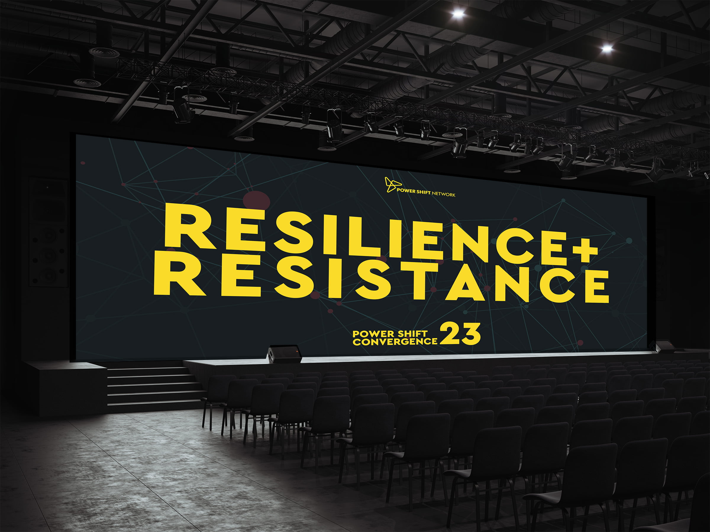
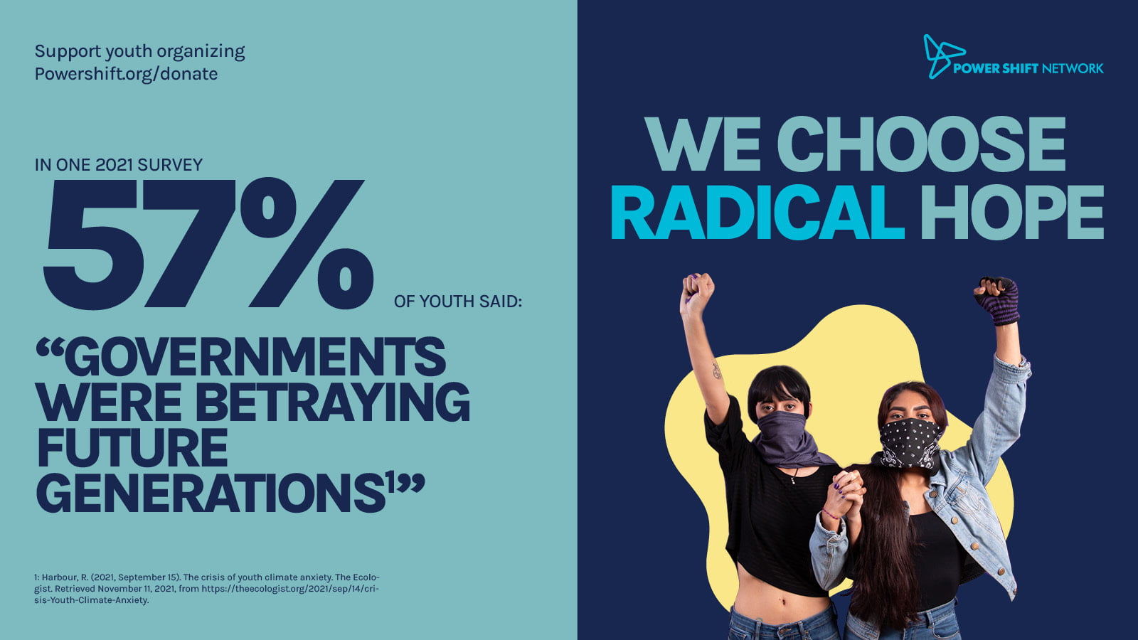
PSN has approached us numerous times for graphic design needs. Last year we designed a radical hope fundraising campaign. Our hard work helped kick start fundraising efforts towards a several thousand youth climate summit, in April of 2023.
Our Role
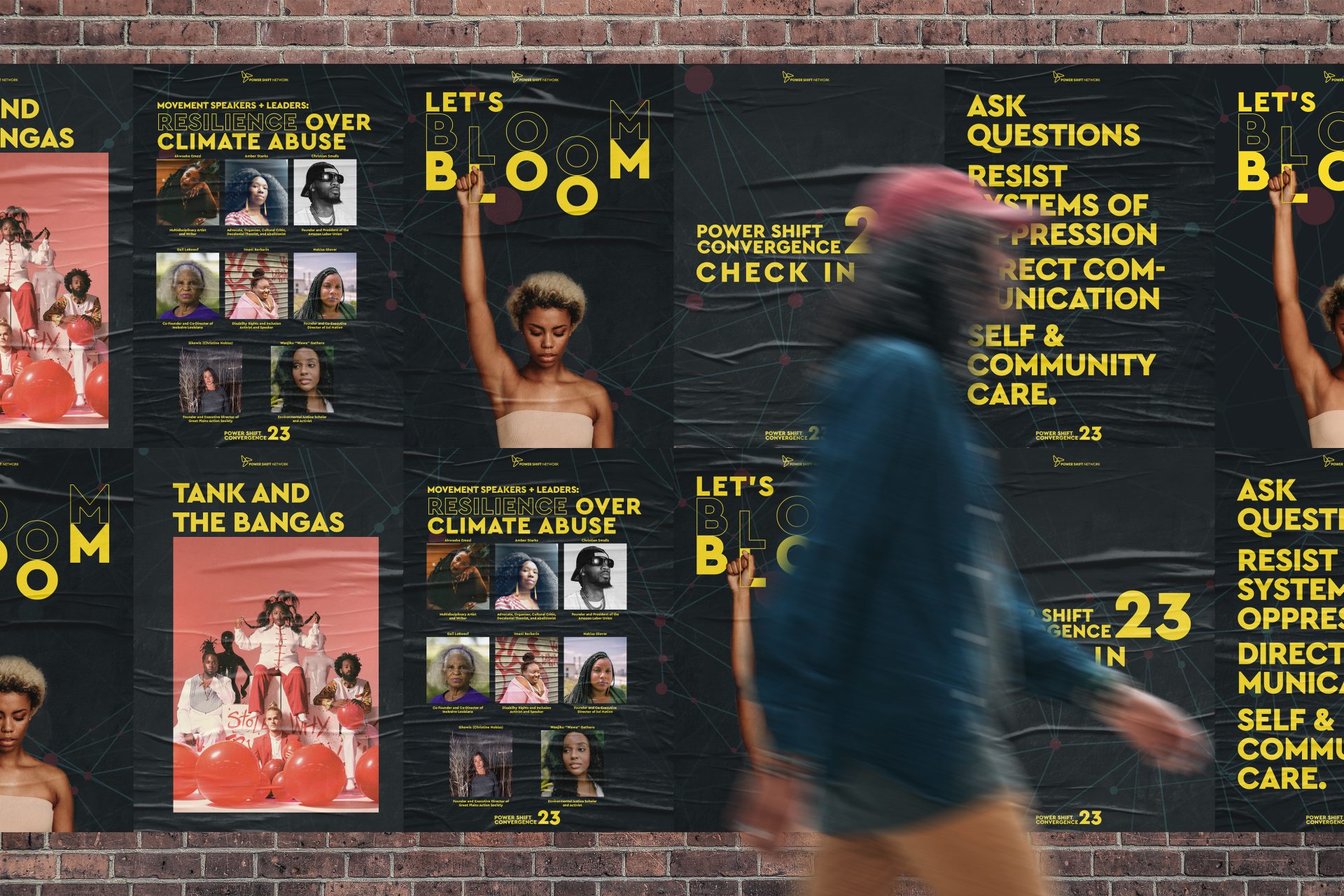
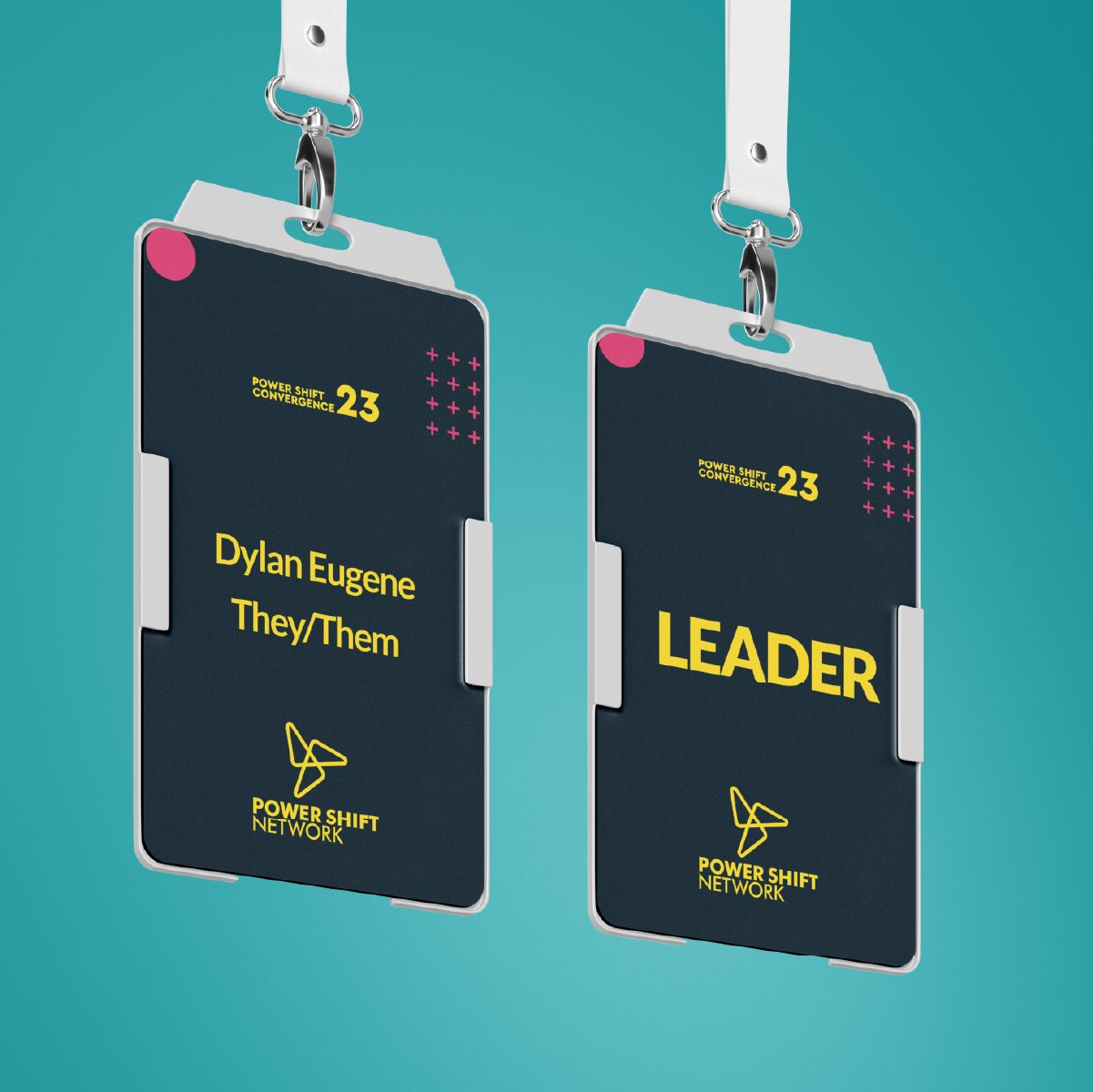
Repeater Digital played a crucial role in the Power Shift Network’s visual communications efforts over the course of 4 months. The company was responsible for the design of various materials, including graphic design, print design, and website design. This involved creating eye-catching graphics and illustrations that would help the Power Shift Network communicate their message effectively and reach their target audience.
In addition to the technical aspects of design, Repeater Digital also provided creative direction and strategy to the Power Shift Network. This involved working closely with the organization to understand their goals and values and then using this information to guide the development of the visual strategy. This involved everything from conceptualizing ideas, to making recommendations on color palettes, typography, and image selection.
One of the key contributions made by Repeater Digital was the implementation of a shared visual strategy. This involved creating a cohesive visual language that could be used across all of the Power Shift Network’s communications efforts. This included guidelines for color usage, typography, and other design elements, as well as suggestions for how the visual elements could be used in different contexts, such as on social media, in print materials, and on the website. By implementing a shared visual strategy, Repeater Digital helped the Power Shift Network Network communicate a consistent message and build a stronger brand identity.
Our Approach
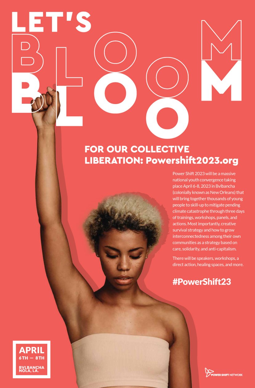
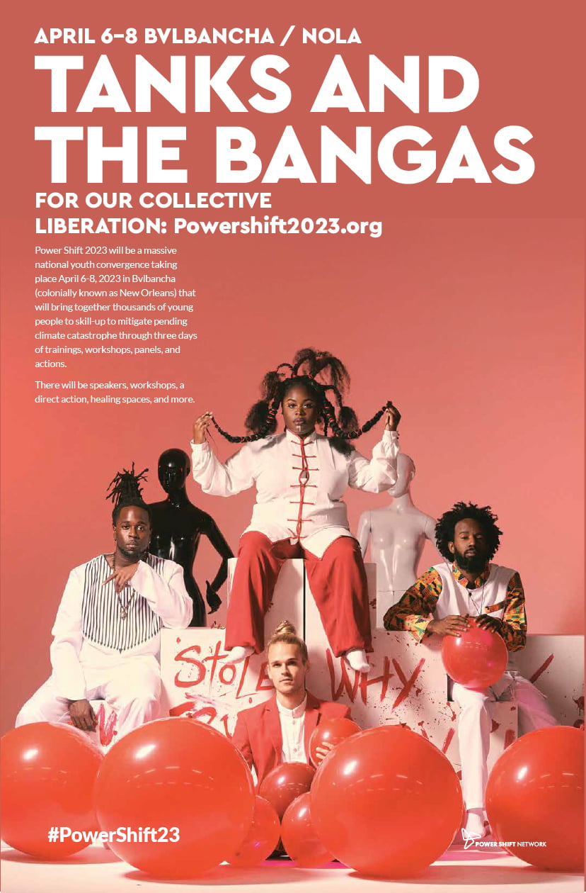
The visual strategy for the Power Shift Network created by Repeater Digital was designed to represent the youthful and energetic spirit of the movement. The focus was on creating graphics that would connect with a younger audience and communicate the urgency of the environmental crisis. The graphics were designed with an intentional visual tension that included contrasting but beautiful colors, bold shapes, and clean lines to evoke a feeling of energy and movement.
Abstract elements were used to represent the interconnected communities in the struggle for environmental justice. These elements were meant to symbolize the complex network of relationships and connections between people, organizations, and movements that are working towards a common goal. The abstract forms were also meant to evoke a sense of fluidity and change, reflecting the dynamic nature of the environmental movement.
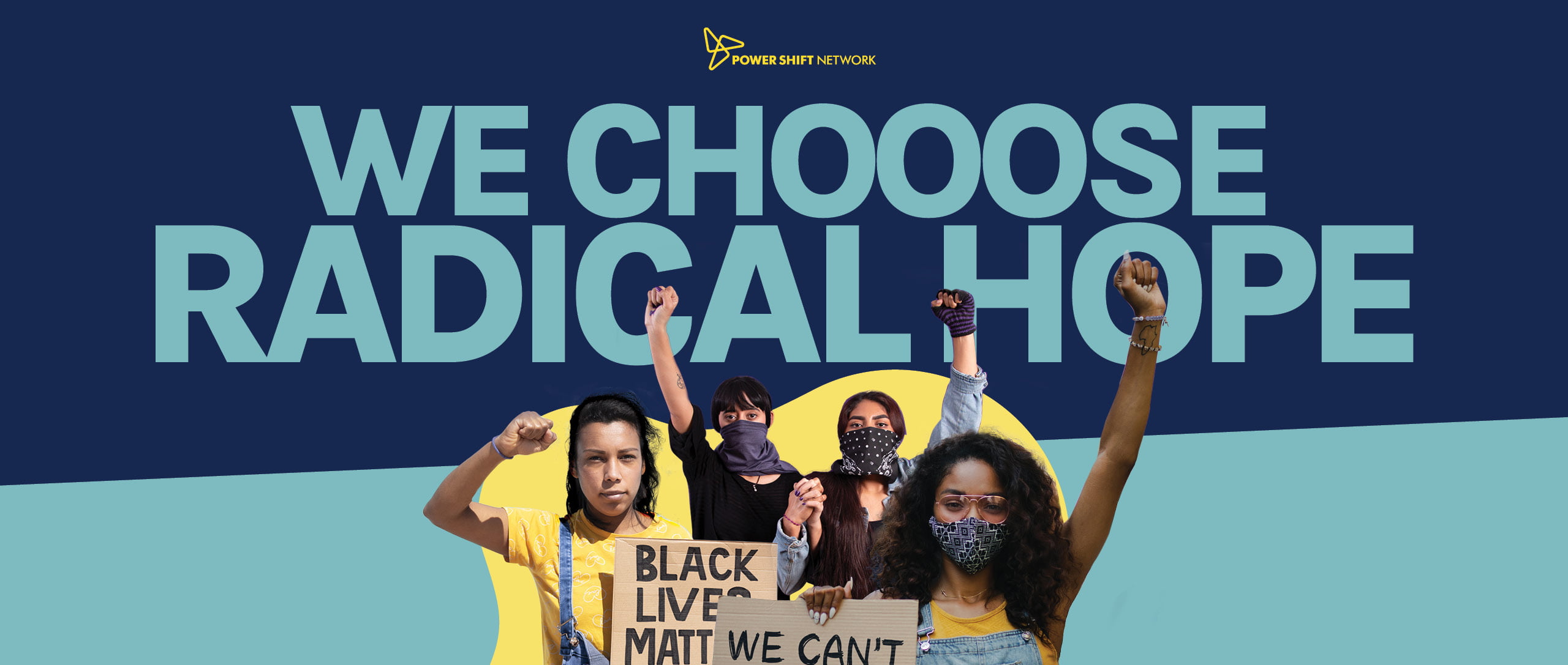
One of the key goals of the visual strategy was to represent the experiences of black and brown communities affected by climate change. These communities often bear a disproportionate burden of the impacts of environmental degradation and are often left out of the conversation around environmental policy. The graphics were designed to showcase the perspectives and experiences of these communities and to bring attention to their struggles.
In addition to representing the experiences of black and brown communities, the visual strategy also included symbols of resistance and justice. These symbols were meant to inspire and motivate people to take action and to make a difference in their communities. The graphics were designed to be empowering and to give people a sense of agency in the face of the environmental crisis.
The visual strategy for the Power Shift Network was developed through a collaborative process that involved input from various stakeholders, including activists, organizers, and designers. The goal was to create a visual language that would resonate with the target audience and effectively communicate the key messages of the movement. Through this process, the visual strategy was refined and refined until it was a cohesive representation of the Power Shift Network’s goals and values.
Overall, the visual strategy for the Powershift Network created by Repeater Digital was a critical component in communicating the message of the movement. The graphics were designed to evoke a sense of urgency, to connect with young people, and to represent the perspectives of black and brown communities affected by climate change. By combining elements of abstract design with symbols of resistance and justice, the visual strategy was able to effectively communicate the goals and values of the Powershift Network.
2022 Fundraising Campaign
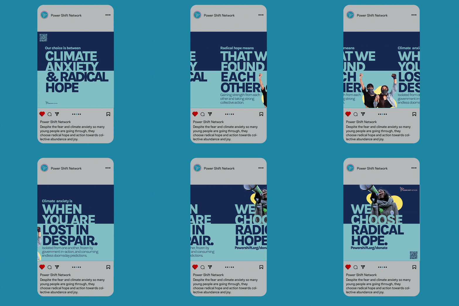
Power Shift Network is a three time client, in the past they’ve worked directly with us for a Power Shift Convergence as staff. They’ve also hired Repeater more recently to do fundraising work for them and a branded social media campaign. We are proud to say we’ve worked together for so long. With different versions of the organization as well. We look forward to future relationships with them.
