Lyman’s Tavern
Art Direction • Design • Print • Typography
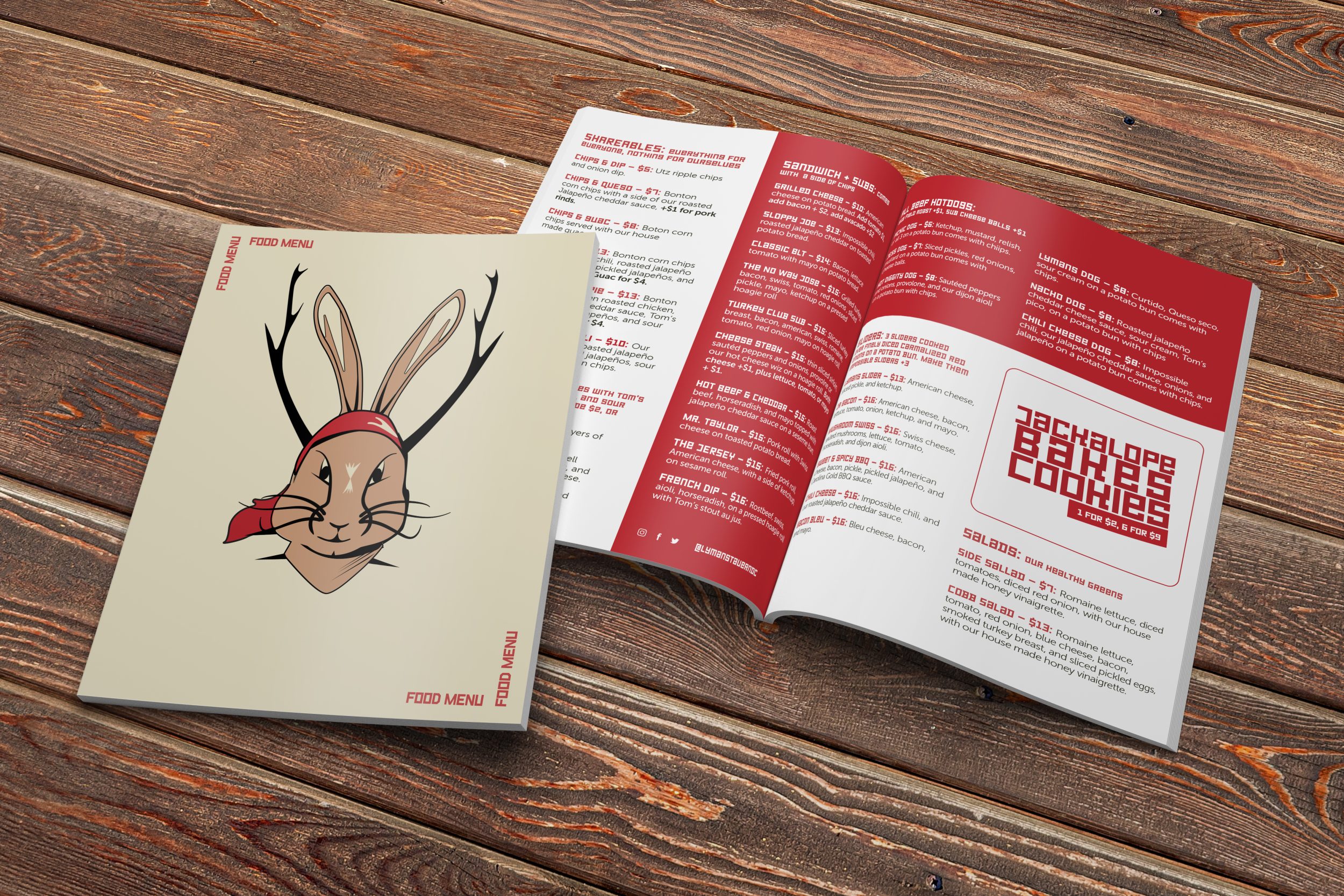
Lyman’s Tavern, a popular Washington DC Petworth neighborhood bar, commissioned Repeater Digital to work on a new menu design. To do this, we created illustrations directly inspired by Eastern European Constructivism. This is a fitting choice for a number of reasons. Art known for bold, simple designs, emphasizing functionality and industrial production.
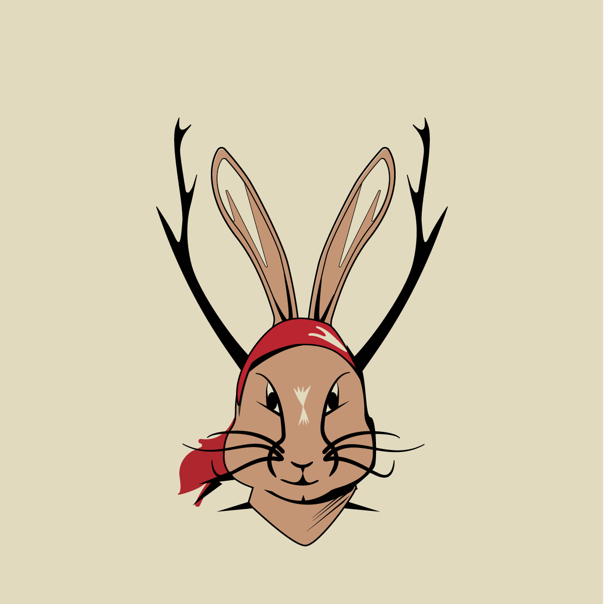
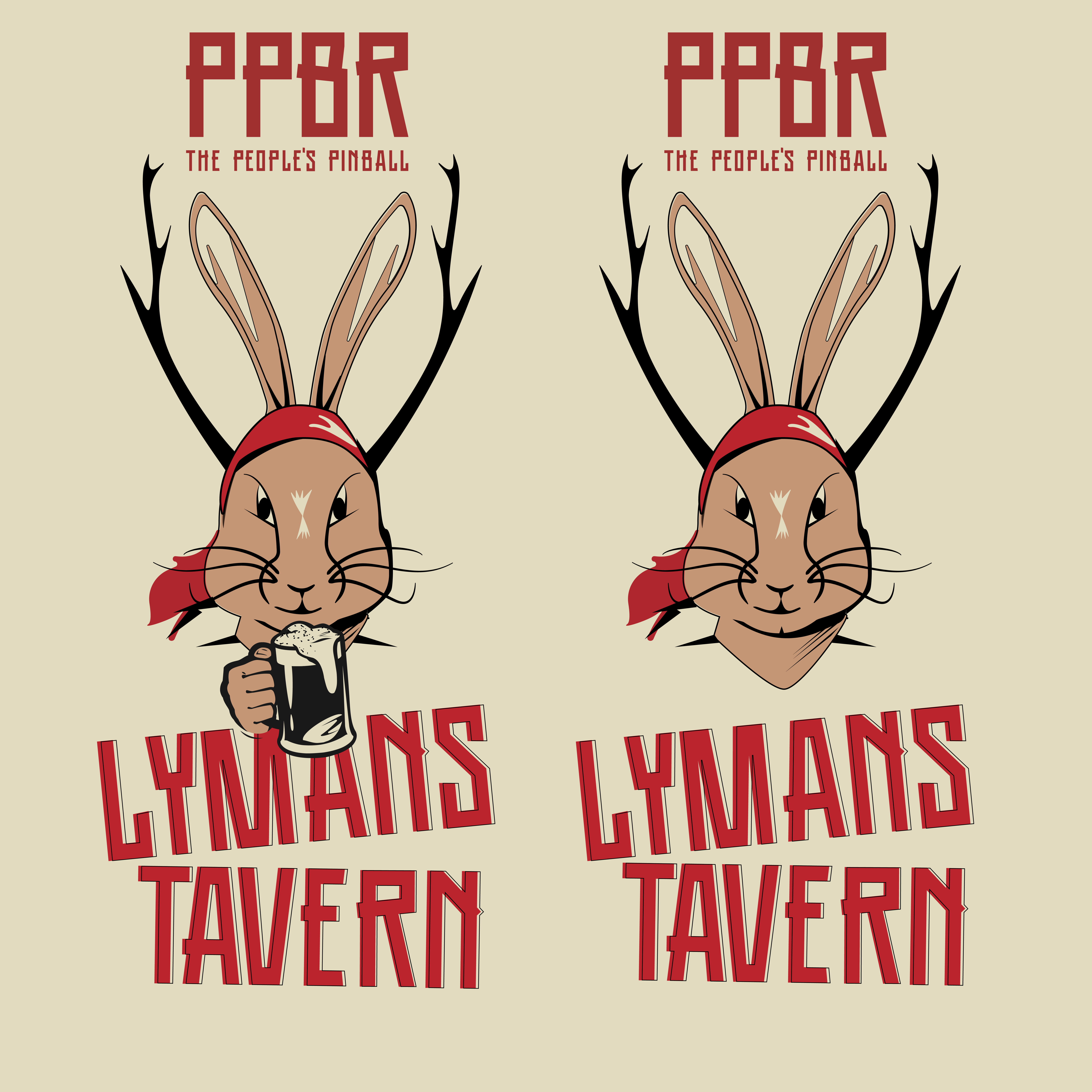
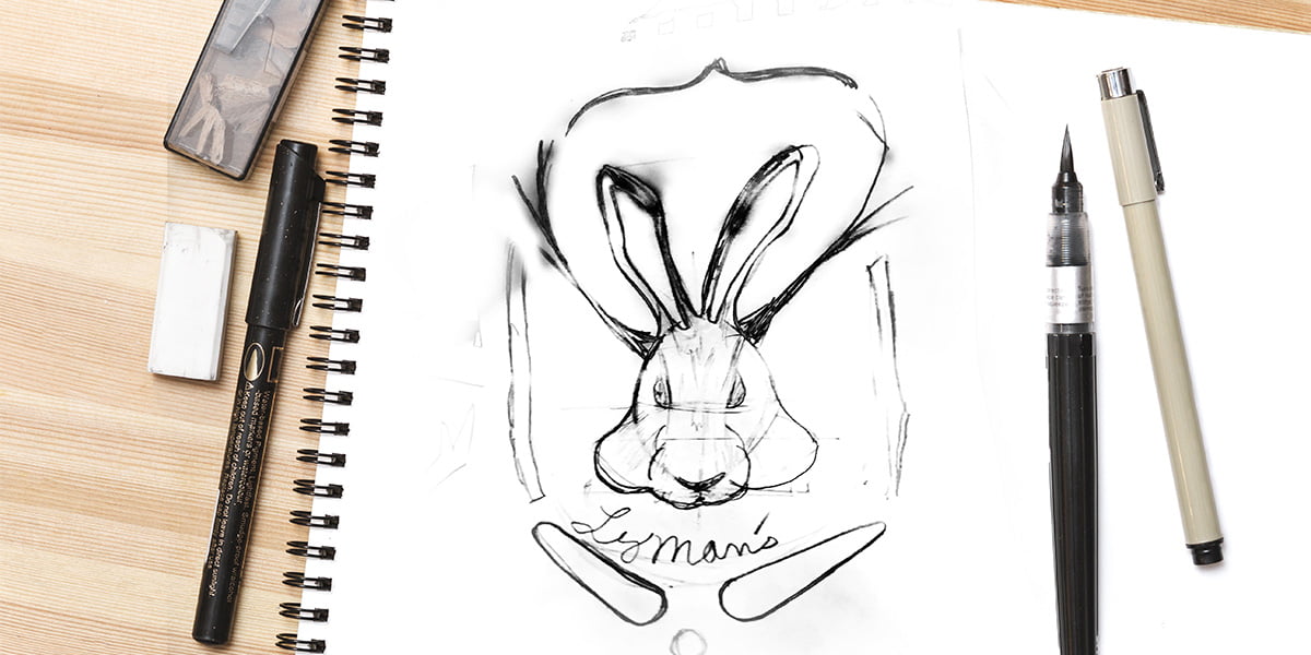
As well as, we took the kind of Jackalope symbolism (an item you can see throughout the bar), into a new stylized illustration.
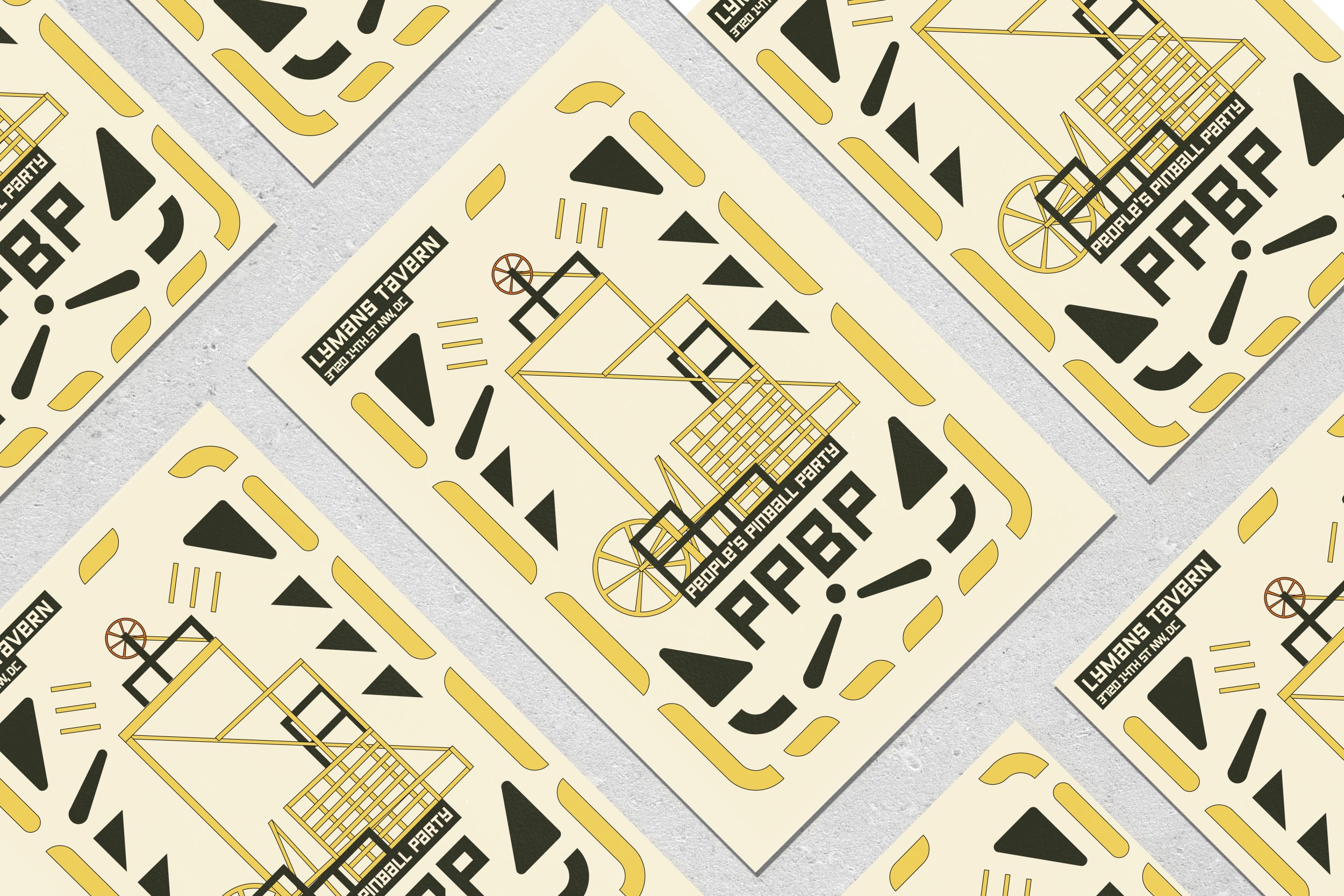
Geometric shapes and bold lines are foundational to the illustration . These traits are hallmarks of Eastern European Constructivist art. Using shapes and lines gives the image order and structure, while also conveying a message of efficiency and functionality. The simplicity of the design makes it easy to recognize as well as memorable. Perfect for a community oriented business wanting to connect with customers and make an impact with its branding.
One key feature of Eastern European Constructivism was the use of text as a visual element. The Lyman’s Tavern illustration reflects this, prominently featuring the name of the bar in a bold, sans-serif font. This reinforces the brand identity of the business, and also emphasizes the importance of communication in the style.
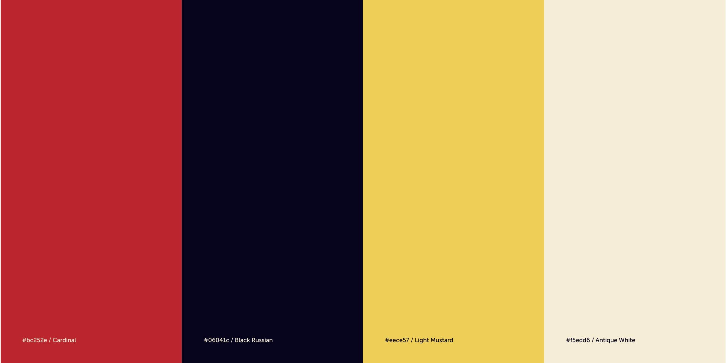
The color palette of the illustration is also reminiscent of Eastern European Constructivism. The use of bold, primary colors such as Watermelon Red, Bone White, Maize Yellow are hallmarks of the style. The colors create strong, eye-catching images. Energy and movement are some of the feelings the design evokes. Appropriate branding for a business that is all about socializing and having fun.
Another important feature of Eastern European Constructivism was its emphasis on industrial production and the use of technology. The Soviet-style Pinball illustration reflects this dynamic in Lyman’s Tavern. This serves as a visual metaphor for the brewing process, and also reinforces the idea of efficiency and productivity.
Overall, the Lyman’s Tavern illustration is a great example of how Eastern European Constructivism can be applied to modern design. Using simple shapes, bold colors, and focusing on functionality and industrial production, the illustration captures the essence of the business. The result is the creation of a strong, memorable brand identity.
